Hisense
High performing TVs and a website to match
Role
UX Research
User Testing
UX Audit
UI Design
Client
Hisense Australia
Completed
2019
Hisense is an electronics brand that sells reasonably priced, high performing products – TVs, Fridges, Washing Machines – you want white or brown goods then they’re your man. Unfortunately, their website wasn’t performing so well with high bounce rates and short page sessions being a common issue.
We were commissioned to audit their website and dig deeper to understand what wasn’t working. Our challenge was then to maintain the underlying HTML structure but switch up the design to facilitate a cleaner, more user-centric website.
Stage 1: The audit
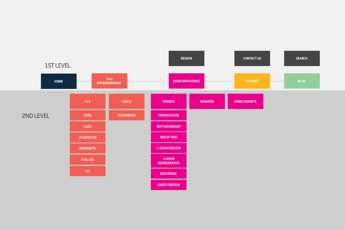
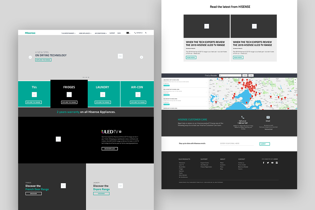
Firstly, we looked at the analytics to understand which pages were in need of a boost – it turned out that the homepage was the main culprit and would need considerable work.
Research into their target audience and the industry revealed tech language that resonated well and nifty competitor techniques for product promotion.
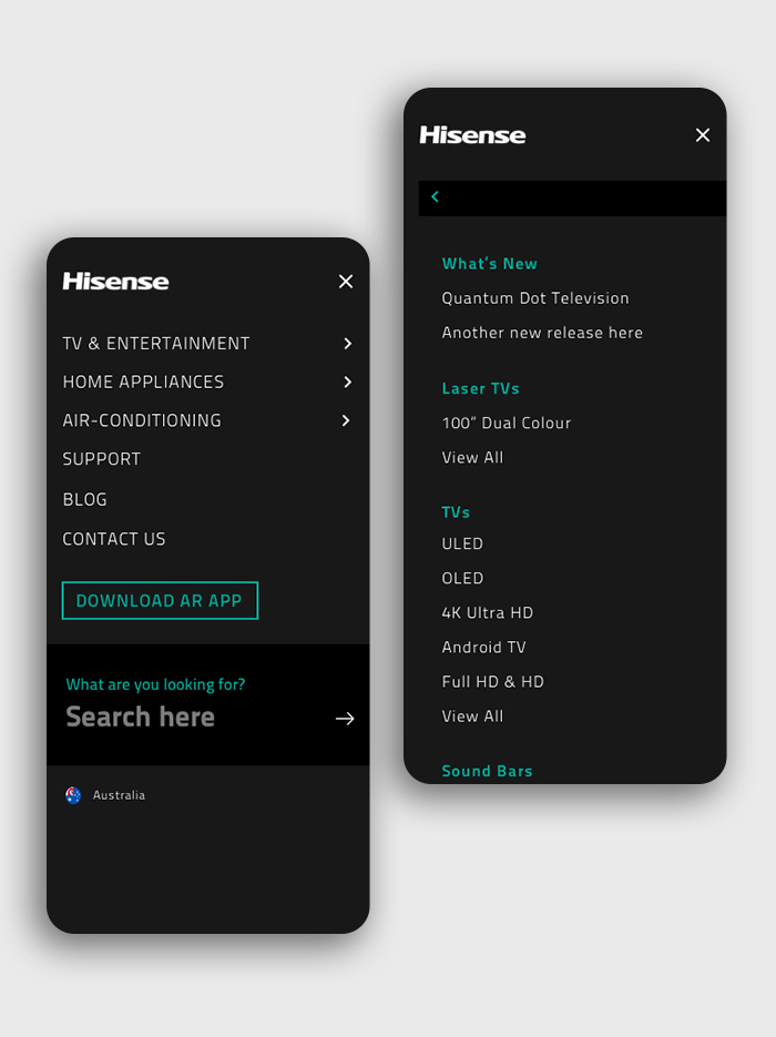
User testing on the old site involved interviews with 20-40 year old’s to understand their on-site behaviour and user-journey pain points. With those findings, I was able to propose a new site navigation and simple UX and UI improvements that would positively impact the site.
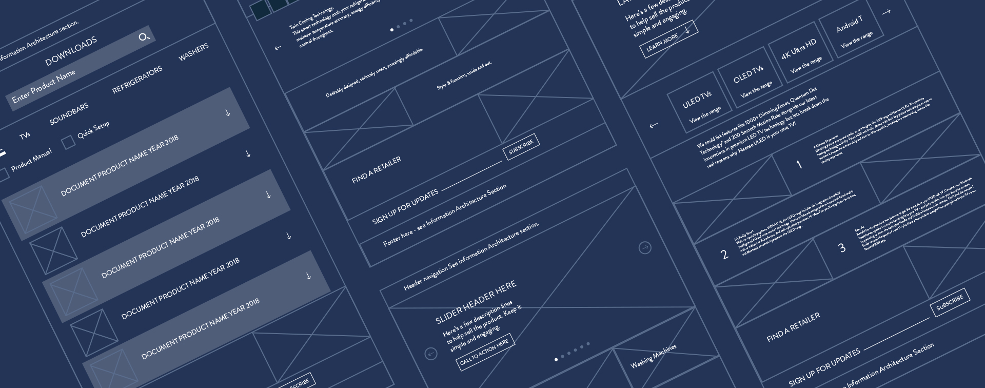
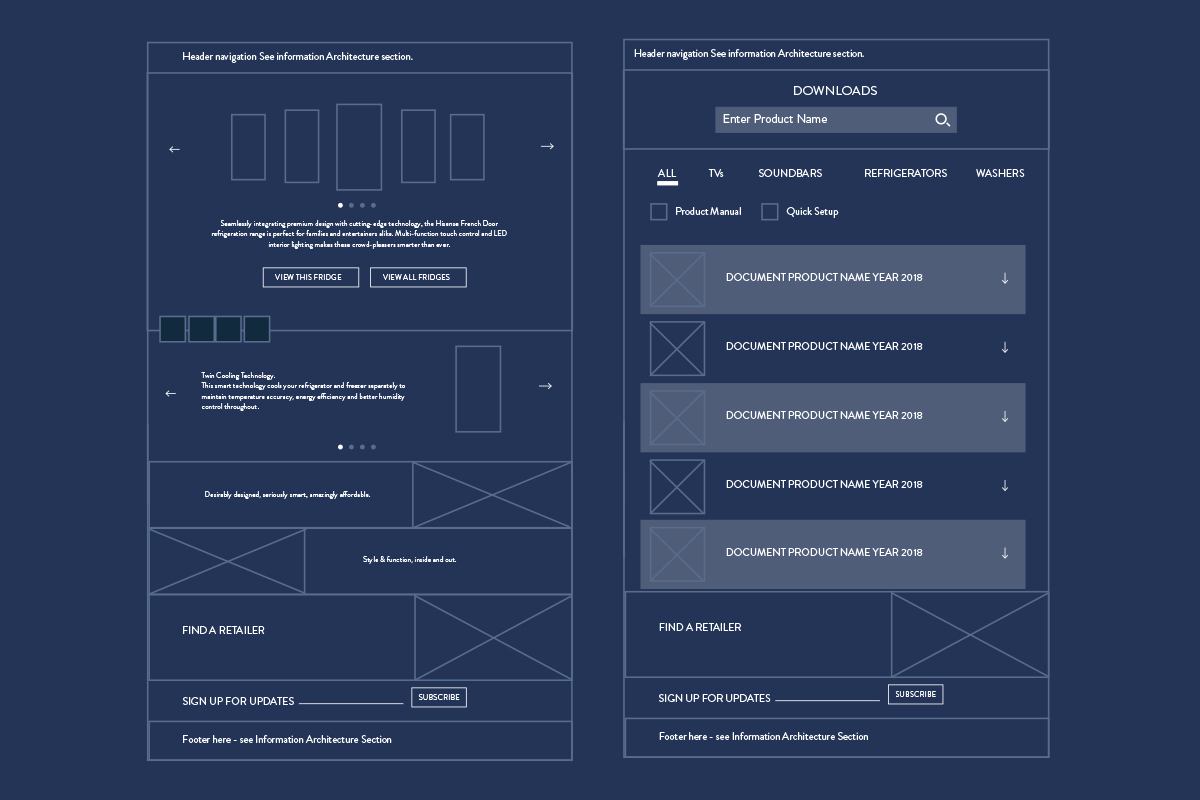
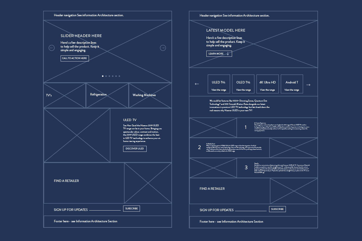
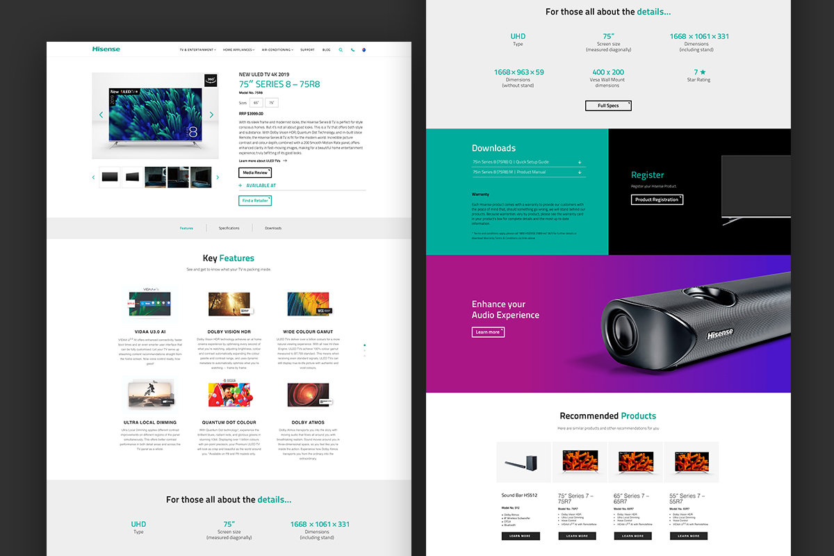
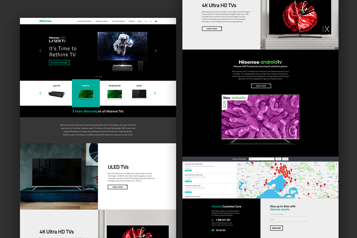
Stage 2: The wireframes
Based on our audit and research I created high fidelity wireframes for the key pages. I then tested them with a new user group – the results were overwhelmingly positive. On the original site, only 25% of users were able to find the TV and Fridge range page. That percentage increased to 100% of users when they trialled my wireframes.
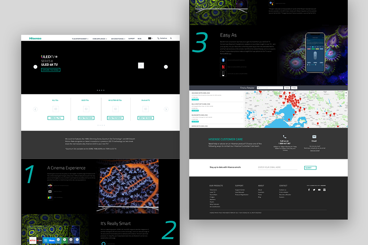
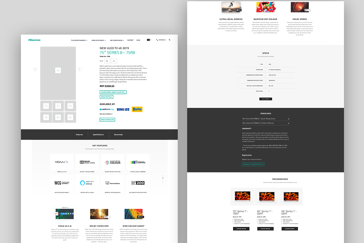
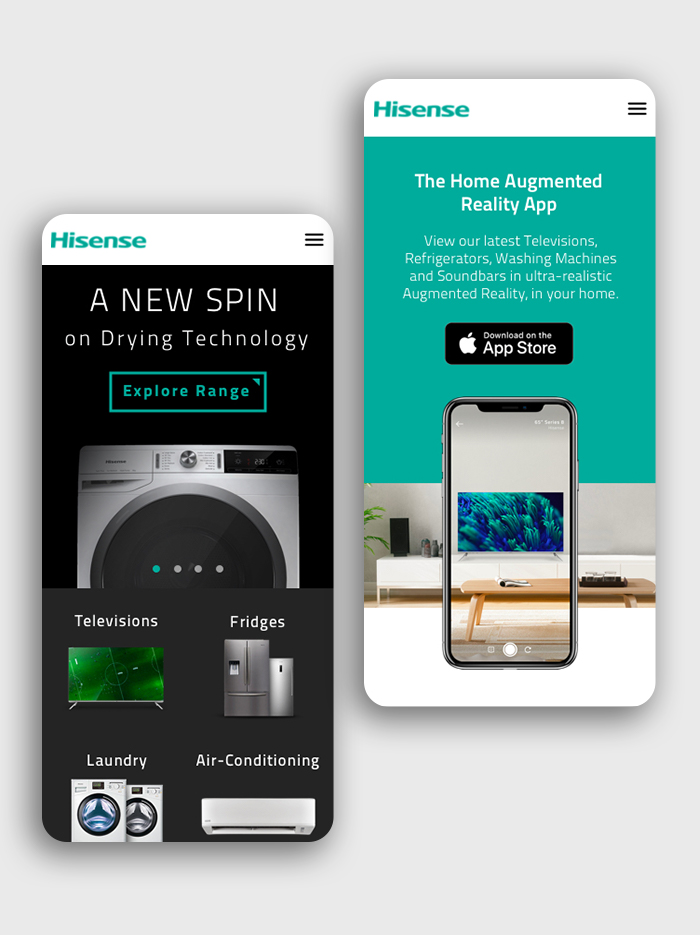
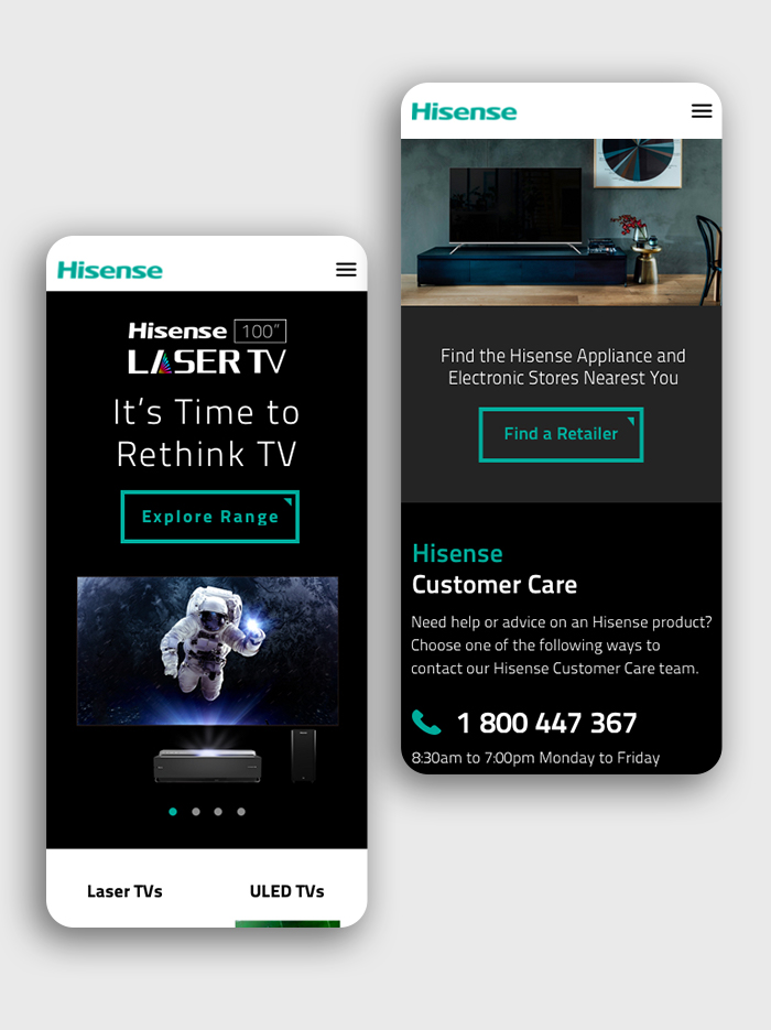
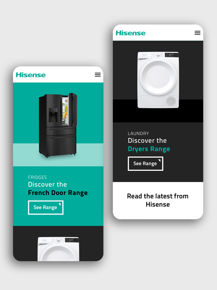
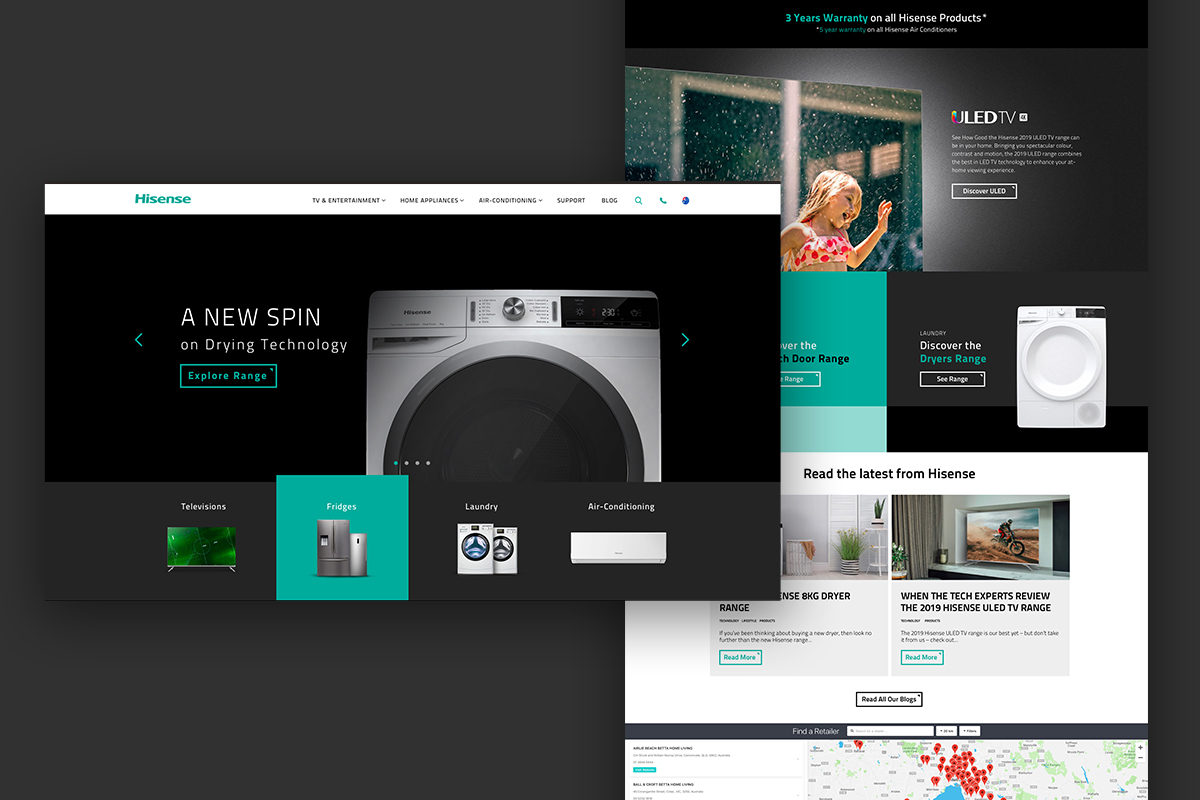
Stage 3: the user interface
Subtlety was key when revising the designs – we still had to keep in line with Hisense brand, follow best-in-practice UI standards and ensure regional UI components were incorporated. Despite these requirements, we were still able to modernise the design by changing font-sizes, line-heights and lengths and optimising the colours to ensure AA accessibility and a clear user journey.
Stage 4: the results:
Not to plug this too hard but we did see a sparky return with an 8.56% decrease in bounce rate and an increase in page session by 7.64%. How good.